Vue3 组件与样式库的选择
Vue3 组件与样式库的选择
网络教程和一些书籍上提供的组件库多以 Element Plus 为主。了解 TailwindCSS 之后发现它更符合我的品味,另外还发现了 Tailwind Plus 替代 —— Shadcn-Vue。
图标库使用 AI 推荐 lucide-vue-next,话又说回来 Shadcn-Vue 自带的也许省事儿点。
TailwindCSS 配置
TailwindCSS 提供一组原子化的 CSS 样式类来构建复杂的 UI 组件,这些原子化的样式涵盖了布局、字体、动画、交互和响应式布局,还有主题配置等等内容。用得好的话,会非常强。
# 通过 yarn 安装 tailwindcss 和 @tailwindcss/vite
yarn add tailwindcss @tailwindcss/vite
TailwindCSS 安装完成后需要在 vite 配置中激活 TailwindCSS 插件,并在主样式文件中引入样式
vite.config.ts 配置如下:
import tailwindcss from '@tailwindcss/vite'

export default defineConfig({
  plugins: [
    tailwindcss()
  ]
})
main.css 主样式文件导入内容:
@import "tailwindcss";Shadcn-Vue 配置和使用
Shadcn-Vue 是一个由社区主导的 shadcn/ui 移植项目。shadcn/ui 专为 React(基于 Tailwind CSS)设计的 UI 组件库,没有 Vue3 的原生支持。Shadcn-Vue 的诞生便是源于 Vue 生态系统对它的需求。
安装依赖前需要编辑两个文件。首先,编辑 tsconfig.json
{
  // 省略已有内容
  // ...

  "compilerOptions": {
    "baseUrl": ".",
    "paths": {
      "@/*": [
        "./src/*"
      ]
    }
  }
}
再编辑 tsconfig.app.json 这个文件
{
  "compilerOptions": {
    // path 属性在 tsconfig.app.json 文件中默认存在
    // 所以之需要添加 baseUrl 即可
    "baseUrl": ".",
    "paths": {
      "@/*": [
        "./src/*"
      ]
    }
  }
}
另外根据官方文档说明,需要对 vite.config.ts 进行配置。但是脚手架默认生成的内容是有路径解析的配置。
当前项目:
create-vue版本3.17.0Vue版本3.5.17Vite版本7.0.0。
为保障后续步骤的正常进行,应该检查一下这项配置。
/* 注释的内容是官方文档提供的配置 */
/* 未注释的是默认已存在配置 */

//import path from 'node:path'
import { fileURLToPath, URL } from 'node:url'

export default defineConfig({
	// ...

  resolve: {
    alias: {
      //'@': path.resolve(__dirname, './src'),
      '@': fileURLToPath(new URL('./src', import.meta.url))
    },
  },
})
执行以下命令进行安装,然后根据需要选择组件进行添加。
# 安装初始化库
yarn dlx shadcn-vue@latest init
# 添加组件
yarn dlx shadcn-vue@latest add button
官方给出的
yarn安装命令使用的是npx,使用该命令执行后,包管理变成npm了?根据
Vue3脚手架使用经验,试了yarn dlx命令,成功且尚未发现问题。
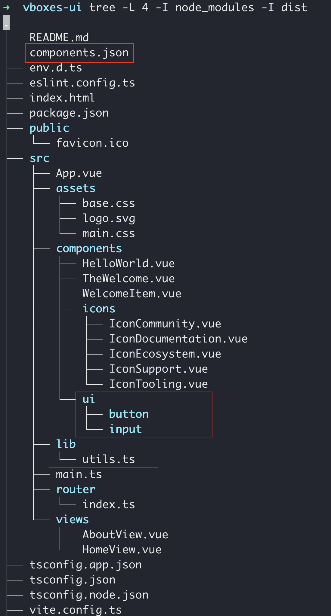
安装并添加组件后,工程目录下会多些东西。components.json 、lib/utils.ts 和 components/ui/*
简单的使用案例
在已有 AboutView.vue 文件编辑如下内容
<template>
  <div class="about">
    <h1>This is an about page</h1>
    <!-- 添加的内容,使用了 TailwindCSS 的样式类 -->
    <div class="flex w-full max-w-sm items-center gap-1.5">
      <Input type="text" :placeholder="name" v-model="name" />
      <Button @click="sayHello">你好!</Button>
    </div>
  </div>
</template>

<!-- 添加的内容,使用组合式 API -->
<script setup lang="ts">
import { ref } from 'vue'
import { Button } from '@/components/ui/button'
import { Input } from '@/components/ui/input'

const name = ref("");

const sayHello = () => {
  alert(`Hello ${name.value}!`);
}
</script>

<style>
@media (min-width: 1024px) {
  .about {
    min-height: 100vh;
    display: flex;
    align-items: center;
  }
}
</style>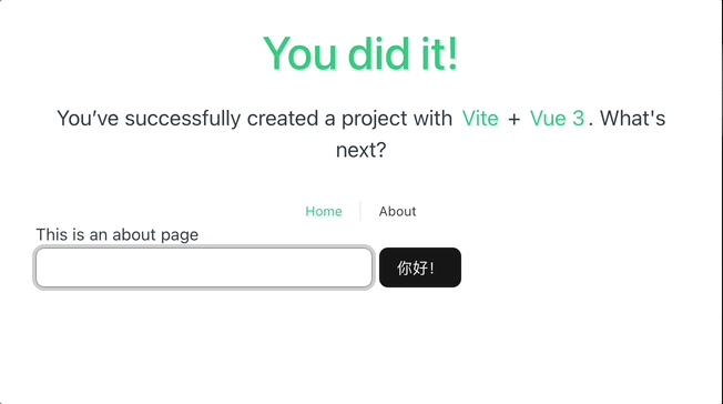
Lucide 配置和使用
Lucide 是一个开源图标库,提供 1000 多个矢量 (SVG) 文件,用于在数字和非数字项目中显示图标和符号。该库旨在通过提供多个官方软件包,帮助设计师和开发者更轻松地将图标融入到项目中,从而更轻松地在项目中使用这些图标。
安装 lucide-vue-next
yarn add lucide-vue-next使用案例
编辑 AboutView.vue 内容如下
<template>
  <div class="about">
		<!-- ... -->
    <div class="flex w-full max-w-sm items-center gap-1.5">

      <User color="black" :size="32" />
			<!-- ... -->
    </div>
  </div>
</template>

<script setup lang="ts">
// ...
import { User } from 'lucide-vue-next'

// ...
</script>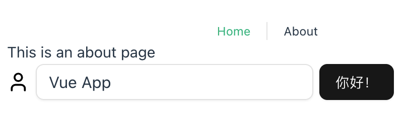
具体的图标名称在这里搜索。
Lucide 图标默认以 Vue 组件方式提供,在用作状态图标时需要单独对其大小进行设置,不太方便,将来能否改用其他方式——以类名方式使用的图标,比如 UnoCSS ?